Many, if not most, of the new breed of mobile devices use touch as their main input
method. While many of the principles we usually apply to interface design are the same,
there are some shifts in mindset required.Our fingers are remarkably dexterous, but they lack the same level of precision of a
mouse. With some care, we can use a mouse to pinpoint a single pixel on an interface—but try
touching a single pixel with your finger.
Interfaces that fail to accommodate the touch paradigm do so not because of any inherent
failing of the input method, but because the designers have jammed too much onto a screen,
or made buttons too small for fingers to easily tap. This is exacerbated by the inherent
problem of touch as an input method: the very act of trying to touch an interface element
obscures that element from our view. In addition, our users need to be able to understand
and use our interface in a whole range of distracting contexts. There’s a delicate balance
between trying to fit as much information as possible into the smaller physical space of a
mobile screen, and offering targets that are big enough for clumsy fingers to
touch.
We should also never forget our users without touch screens!
They’re customers too, and their input method is likely to be extremely unfriendly. Older
feature phones (and some smartphones) use four-way navigation (often called a D-pad) as their primary input method,
forcing users to scroll past several elements in our interface to reach the button they
want. BlackBerry’s browser uses a tiny trackball or scroll wheel to navigate the interface;
hence, wherever possible, it’s worth aiming to limit the number of elements on the
screen.
Above all, it means simple interfaces. Simple means easy to understand, which leads to
easy to use.
Simplicity is a feature, and while complexity is not necessarily a vice, we need to keep
some perspective. As invested as we might be in the depths of functionality of our
application, the behavior of our users is not likely to match our interest. Our users are
likely to spend mere seconds or minutes in our application—if we can convince them to visit
at all.
We can’t assume that users have the time (or the inclination) to figure out how our
application works.
1. Hover Me
Designing for touch devices requires a shift in our thinking. Many of the techniques
we’ve been used to employing no longer work, or at least don’t quite work as we’d like.
The most obvious of these is hover:
Elements that rely only on mousemove, mouseover, mouseout, or the CSS pseudo-class :hover may not always behave as expected on a touch-screen device such as
iPad or iPhone.
Hovering as an interaction model permeates the Web. We’re used to our mouse movements
triggering changes to a page on hover: different colors or states for links, revealing
drop-down navigation, and showing actionable items, to name a few. And as designers, we’ve
readily embraced the possibilities that the hover state gives us. Most touch-based
operating systems will do some work behind the scenes to try to ensure the interface deals
with hover states in a non-catastrophic way, but we are going to have to start changing
our habits. For example, in lieu of a hover state, consider:
making buttons and hyperlinks obvious
having content that doesn’t rely on :hover; for example,
increasing contrast on text
avoiding drop-down menus without clear visual cues
We might lose a little flair, but we’ll gain clarity of interface.
2. Small Screens
There’s no escaping that designing for mobile means designing for small screens.
Mobile devices have displays that are significantly smaller—both in terms of physical size
and resolution—than their desktop counterparts. This is an opportunity to be
embraced.
Still, finding the right balance between information and interface to display on a
small screen is a tricky problem. Too much detail and our interface will become cluttered
and confusing. Too little and our users will have to work to find the information they
need. This doesn’t necessarily mean reducing content; it means reducing clutter.
In other words, don’t be afraid of making an interface information-rich. A carefully
designed interface can hold a wealth of information and communicate it effectively. Hiding
information behind interaction may be the path of least resistance, but it’s not
necessarily the path we should take. People use their mobile devices to complete tasks or
seek out information: they want to find out when the movie is playing, when the next train
will arrive, or where the nearest café is. They would prefer not to spend hours exploring
a sparse and delicately balanced interface. We want to give as much information as we can
to our users without overwhelming them.
3. Cognitive Load
Simplifying the interface is really about reducing the cognitive burden we’re placing
on our users. This is essentially the overriding principle behind Fitts’s Law. For
the uninitiated, Fitts’s Law is a model of interaction that’s become a fundamental when
understanding user interface design. It states that the time to acquire a target—like say,
moving a mouse over a button—is a function of the distance to and the size of the target.
Simply put, the larger an item is and the closer it is to your cursor, the easier it is to
click on.
A classic example of adapting to this principle is the menu bar in Mac OS X. It’s a
small target that’s usually a fair distance from where your cursor normally sits; yet this
is counterbalanced by placing the menu against the top of the screen, preventing users
from overshooting the target. Being on the edge effectively gives the menu bar infinite
height, resulting in fewer errors by the users, who reach their targets faster. For a
touch screen, however, Fitt’s Law has to
be applied differently: our users aren’t tied to the position of their mouse, so the
origin of their movements is simply the default position of their fingers or thumbs. That
position varies a lot on the device and its orientation; for example, with a mobile
device, you might use the index finger of one hand or the thumbs of both hands.
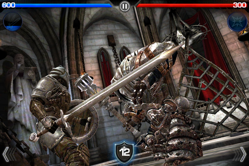
Here’s an example of this issue in a real application. Infinity Blade is an immensely popular game for iOS. It’s available on both
the iPhone and iPad, and uses the same interface for both devices. The game is played with
the device in landscape mode, and the controls are anchored to the bottom of the screen
(where your thumbs are), as you can see in Figure 1. On the
iPhone, the “cast-spell” button is in the middle of the screen, within reach of either
thumb. Yet this feature is less effective when found in the larger form of the iPad. The
“cast-spell” button is still in the middle of the screen, but no longer within reach of
our default hand position.
This is just one example, but it should serve to illustrate the importance of
considering how your interface will be used on a real device. You need to think beyond
“point-and-click”!